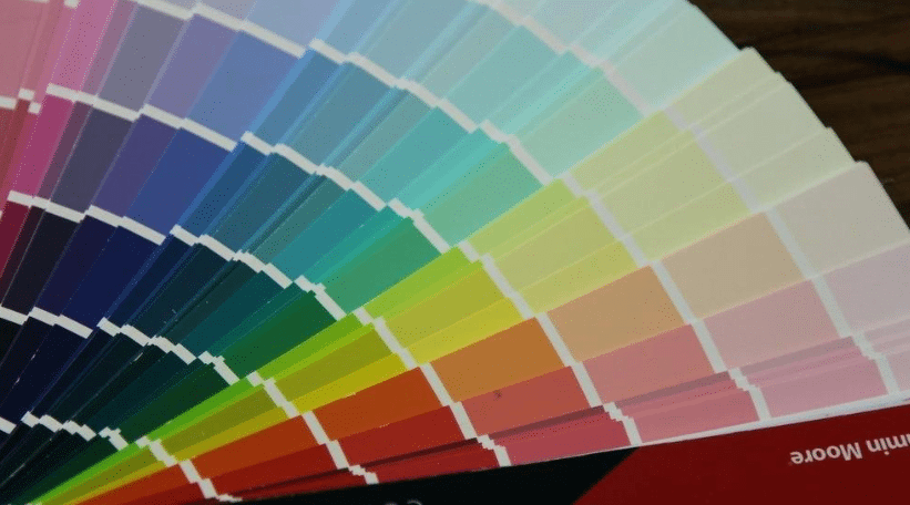
While the world around you might feel as though it’s going to heck in a handbag, home interiors next year will feel anything but. The paint forecast for home interiors in 2019 features restful, natural and deeply peaceful colors, like hazelnut and teal, along with a few happier colors like lemon and rose. The result is a palette that feels happy and is extremely pleasing to the eye.
Hazelnut
The love affair with browns and beiges continues and combines next year with this light nutty color. Hazelnut is a perfect backdrop for stronger colors but also works well in more monochromatic schemes. The color is not only soothing but sophisticated, too. (Think of how delicious hazelnuts look in a cake or tart!)
French Vanilla
Equally delicious and soft in hue, French vanilla is a creamy white with a tinge of yellow. As a paint color, French vanilla works best in warm color schemes. And like hazelnut, it serves as a nice backdrop for a more colorful palette. The tinge of yellow gives this neutral a sunny disposition.
Lemon Yellows
In hues ranging from light sorbet to rich custard, lemon yellows made a big splash this year and are expected to return for an encore performance. Lemon Sorbet, in fact, was a top color pick for Benjamin Moore this year. Lemon yellows are not only sunny in disposition but downright blissful, which is certainly one of the reasons for their staying power.
Dark Teal
Dark blue-greens, like teal, are expected to continue their ascent in home décor. Blues and greens are both calming colors; combined together in saturated hues, they bring “calm” to a whole new level. To make this paint color look rich, accessorize it with metallic golds.
Nightwatch
Another blue-green blend, Nightwatch leans toward the green side with a bold intensity. PPG has chosen Nightwatch as the top paint color next year and describes it as a rich hunter green. Whether you see it as teal or hunter, Nightwatch likely will be used on accent walls rather than in entire spaces. But even in small doses, it conjures up a feeling of contentment—like a walk through a forest might do.
Grayed Lilac and Iced Blue
These two widely forecasted colors are similar in that both are “barely there” hues tinged by a frosting of gray. They have something else in common, too. Both are being mixed together to create a third color—a misty, ethereal shade—that evokes contemplation. As paint colors, grayed lilac and iced blue are versatile and work with many other cool shades, such as deeper purples and blues.
Pinks and Roses
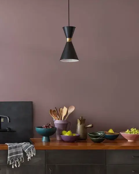
There’s no denying it: Pinks and roses are happy colors! Next year, you can expect to see them in hues ranging from whispery soft (perfect for all-over wall cover) to deep and velvety (ideal for accent walls). You also can expect to see variations of these colors. As an example, one of the more popular colors next year will be a deep rose-tinged by orange. Can there be any color happier than that?

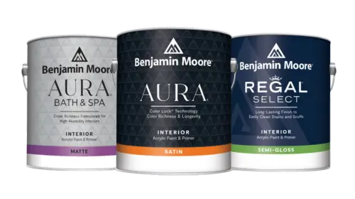 Interior Paints
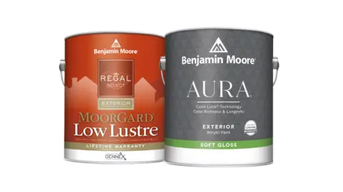 Exterior Paints
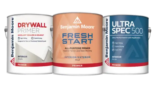 Primers
 Stains & Clears
 Paint Brushes
 Paint Roller
 Paint Trays & Liners