Bolder colors are on the rise. How can you incorporate them in your home?
By Diane Franklin and Tammy Adamson-McMullen
All of the 2018 Color of the Year pronouncements have made their appearance in magazines and websites across the world. Many of this year’s forecast colors are bolder and more vibrant than in previous years. Does that mean you should be bolder and more daring in every room of your house? Not necessarily. Some bolder choices are perfect for public areas of your home, like your foyer or great room. In other areas, such as your bedroom or home office, you may want to go subtle and quieter.
With that in mind, here are our room-by-room suggestions for color schemes that will set the right mood.
Foyers and Great Rooms
Color experts have identified some hot hues for the 2018 palette that would bring drama to foyers and great rooms. Benjamin Moore’s Caliente is described as “strong, radiant and full of energy.” PPG’s Black Flame is a statement-making black infused with a deep indigo undertone, sure to warm up this year’s interiors. These colors would work well in a foyer or on a feature wall in your great room. If you would rather go for an understated rather than a bold look, considered the gray-influenced colors (in such shades as gold, blue or yellow-green) that are still dominating the palette in 2018.
Colors to avoid: Avoid the syndrome of the “white box.” Whites and off-whites in these spaces are safe—but maybe too safe. You want to make a great first impression when people enter your house, so use an eye-catching color to set the mood.
Living Room/Dining Room
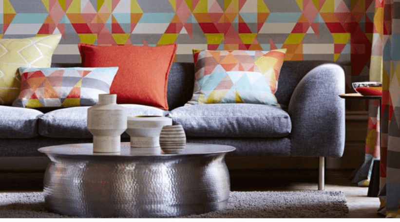
“Livable” best describes color schemes for living and dining rooms. Try not to use any color that is too shocking in these areas, since they often are enjoyed by guests as well as family members. Trending livable schemes include violet and charcoal; peach and sage green; golden yellows and sandy browns; and deep blues and greens offset by white. Monochromatic schemes of white paired with just about any other color—from soft beiges and deeper browns to bright greens and dark navy—also are popular and help to create sophisticated settings. To create a space that is both livable as well as a show stopper, try combining white with shades of deep gray and accents of silver.
Colors to avoid: Color mish-mashes. Don’t let color schemes get too complicated in these rooms. Choose a scheme and stick to it and bring in additional colors, if desired, with smaller accessories.
Kitchens
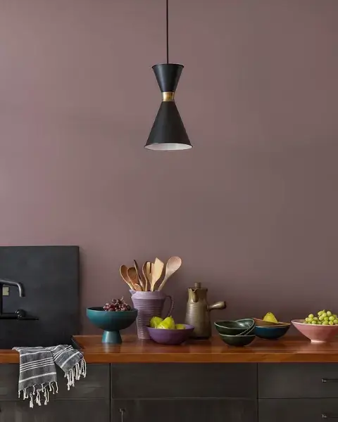
With kitchens, “light and airy” is traditionally the way to go. You want to start your morning with a nutritious breakfast and a bright, optimistic outlook on the world. Many kitchens look inviting in off-whites, soft yellows, pale greens or light blues. However, bolder colors—such as deep reds, clean greens, charcoal and navy—are finding their way into more contemporary kitchens. These are being used not just for wall colors but for cabinets, too. If you choose these colors, do so carefully and make sure they flow with the rest of your home’s décor.
Colors to avoid: Color psychologists have found that warm colors like orange and bright red stimulate the appetite, which is great if you want your family and guests to really dive into their food. But if losing a few pounds is on your mind, then steering clear of those colors can be helpful to your diet!
Bedrooms
Bedrooms are a place for rest and relaxation, so consider such soothing colors as off-whites, light blues, corals, lavender and sage green. If you like bolder color choices, consider using such jewel tones as gold, sapphire or turquoise but in slightly muted shades to make them easier on the eye.
Colors to avoid: Bright, intense colors. You want to wake up gradually, not have your eyes assaulted as soon as you open them.
Bathrooms
Spa colors continue to dominate bathrooms. Oceanic blues and blue-greens, sandy browns, oyster gray, botanical greens and purples, coral and marble white are still the rage and work well with bedroom color trends. Because many of these colors are popular in bathroom tile and countertop options, they undoubtedly will have staying power. One of the most popular color combinations is charcoal and white, which work well with marble countertops and weathered resilient floors.
Colors to avoid: White-on-white schemes and neon hues. Bathrooms need a bit of color to feel relaxing, but the color interplay should be one that soothes, not jolts.
Home Offices/Laundry Rooms
There is only one rule when it comes to selecting colors for home offices and laundry rooms, and it is fairly easy to follow: Choose colors that you love! Chances are you spend a lot of time in these areas in doing tasks that you don’t always relish. To make the tasks more enjoyable, infuse these rooms with your favorite mid-tone colors. Mid-tones, which are neither too light or too dark, can bring a sense of peace and help you to focus. Mother Nature’s colors are perfect for this assignment and include leafy greens, garden florals, sky blues, berry reds and earthy browns.
Colors to avoid: Pastels and brights. Pastels can lower your energy level, while bright colors can zap it.

 Interior Paints
 Exterior Paints
 Primers
 Stains & Clears
 Paint Brushes
 Paint Roller
 Paint Trays & Liners
