It’s winter—time to cozy up!
By Tammy Adamson-McMullen
Brrrr … baby, it’s cold outside! Time to cozy up with sweaters, coats and other layers. It’s also time to cozy up at home, so grab extra blankets and a throw or two. And don’t forget the paint brush! Did you know that you can cozy up with paint? It’s true—the right colors and color schemes can make your home “feel” warmer, even as the temperatures drop outside.
Mid-tone colors in just the right shades are the key components of a warm environment. The warmest of these colors have a yellow base or tinge that adds some “heat” to the way they look. (Think of tropical fruit and plant colors.) Blue-based colors, on the other hand, have the opposite effect. (Imagine the blue undertones of an iceberg or cool ocean waters).
Here’s a look at some of the best warmth-creating mid-tone colors and color schemes. All are part of next year’s predicted 2019 palette so you can’t go wrong, even when the temperatures start to climb.
Naturals
Warm naturals are some of the coziest colors in home décor and also some of the most on-trend. They include browns like charcoal and coffee; yellow-based beiges that range from mushroom all the way to gold; and warm grays like charcoal and greige (a mix of gray and beige). Sometimes these browns and beiges are tinged by warm red and produce browns that are nearly terra cotta and beiges that are nearly blush. To choose the warmest shades within this color family, think of how the earth looks when it’s baked by the sun.
Gray often is thought of as a cool color, and it can be; but you can identify warmer shades because they have tinges of red or yellow. Additionally, warm grays pair well with colors that you might not otherwise consider, such as sunny yellow. You’ll have no trouble finding warm grays next year because they have a significant presence in many paint companies’ upcoming color collections.
Greens
Warm greens are nature-based and look as though they’ve come straight from the field. They include sage, olive, avocado, lime and apple. Many color experts note that greens in general have become such an important part of the palette that they are now considered part of the neutral category. For that reason, greens many times are used as an accent color rather than the dominant color within the scheme. But greens can be a main player, too, and pair well with a variety of other warm-based colors, such as red and beige. When used with white or cream, nature-based greens not only look warm but fresh; however, to keep the scheme warm, make sure any neutrals you pair with these greens have a strong yellow presence, too.
Sun-Drenched Reds
It’s fairly easy to choose a warm red simply by thinking of the reds that are bountiful in warm climates, such as orange, persimmon, mango and tomato. Other sun-touched reds include terra cotta, brick, peach, apricot, crimson and warm wine. You’ll see a lot of these colors at present, as at least one major paint company has named a warm red as the No. 1 color of 2018. That’s good news, since the color is so versatile. For the coziest of schemes, pair brick with griege; peach with avocado; or wine with apple green. Cornsilk, a soft and muted yellow, is a beautiful color to add to any of these schemes for a little more warmth.
Yellows
No discussion of warm color schemes would be complete without yellow, which not only touches all of the colors but stands proudly on its own. Warm yellows are easy to find in both residential and commercial decors because they have the unique ability to both cozy up a space and make it feel sophisticated, too. Mid-tone yellows include lemon, butterscotch, cornsilk, mustard, fawn, honey … the list goes on and on. For the coziest of spaces, use yellow as the main paint color and pair it with a neutral, such as charcoal. But you can warm up any décor by simply dropping some yellow into the scheme—with lamps or decorative pillows, for example.
Purples
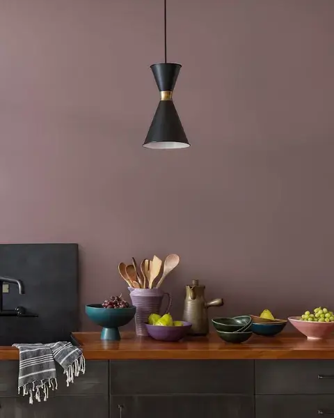
Like gray, purples are often thought of as “cool” colors. And it’s true that some of the most popular purples at the moment are cool in presentation—meaning they have more of a blue than a red base. However, purples that lean toward the red side also are gaining and include red violets, plums and red wines. These purples look stunning when combined with a yellow-based neutral, such as wheat or charcoal, and take on a whole new level of warmth.

 Interior Paints
 Exterior Paints
 Primers
 Stains & Clears
 Paint Brushes
 Paint Roller
 Paint Trays & Liners