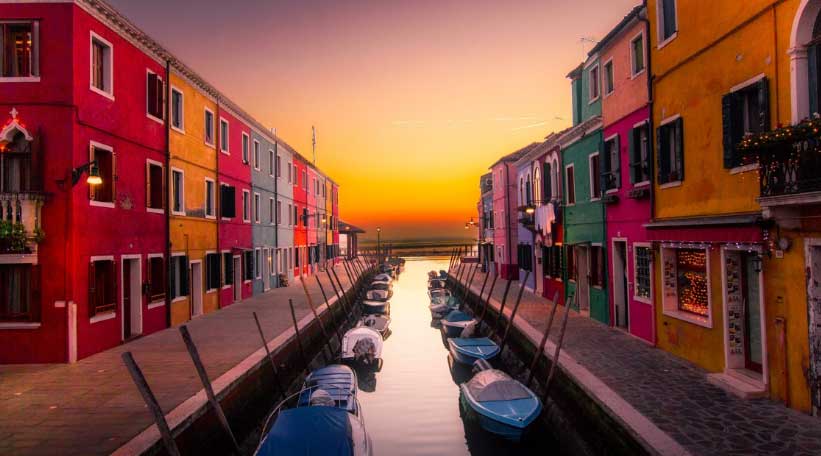
Deciphering the home décor color trend cycle can help you choose your home’s color palette.
By Tammy Adamson-McMullen
If you shop for home furnishings this autumn, you may notice that the color palette has shifted. It’s not easy to findproducts in some of the colors of yesteryear, such as a blue-based sage, bright red or lime. But the sky’s the limit if you wantgold-based colors(olive, khaki, peach and orange);grayed-off colors(dusty pinks and purples, misty blue and charcoal); and complex mixes (teal, rosy beige and brown mauve).
The constantly shifting palette may make you wonder, how and why do the colors on the market change?
The Color Cycle
First, it’s important to understand how color cycles through the market. Color trends typically start in apparel and then move into other areas, such as the automobile and home-fashion industries. The thinkinghas been that if you feel good wearing a color, you’ll feel good driving in it and living in it, too.
The cycle used to move fairly slowly, but today it’s at a much faster clip. Take gray and silver, for example. These two colors began dominating the apparel industry several years ago and almost immediately did the same in the auto and home-fashion industries. Today, all three industries are impacted by this color family. In the auto industry, shades of gray and silvermake up nearly 27 percent of the vehicles on the road.
To experience the color cycle first hand, watch blue in the coming year. Fashion experts predict that sky blue, which currently is popular in women’s apparel, next year will become powder blue, which is a lighter and slightly grayed-off color. As you see powder blue move into your favorite apparel stores, see how long it is before you see it in home fashion, too. If experts are correct, we may be decorating our homes in this color soon.
The Mood at Home
Now that you understand the color cycle, you may wonder how specific colors enter the cycle in the first place. Many factors impact the color palette at any given time, includingnational events and the “mood” within the country. When theeconomy is thriving and political climate is positive, the palette tends to be upbeat, with colors that are cleaner and brighter in hue.The opposite also is true. During economic downturns and times of political unrest, the palette becomes darkerand more subdued.
The national impact on the palette tends to be slow and steady—but not always. In the aftermath of 9-11, the color palette went dark. Before that tragic event, the palettefeatured light and happy colors; but afterward, the palette almost overnight became dominated by shades of brown. The palette, in fact, didn’treally brighten again until the 2008 election when reds, blues and other mid-tones re-entered the palette.
The World at Large
World eventsalsoinfluence the palette—a phenomenon that has increased in recent years since these events can be viewed in real time. The Olympic Games area perfect example, as the colors and styles associated with the host country inevitablyfind their wayinto consumer markets. After the 2012 Summer Games in London, for example, the iconic colors and image of the Union Jack became popular worldwide and appeared in apparel, automobiles (the Mini Cooper) and many home furnishings. Other impacts include foreign politics, travel shows and international sports and celebrities.
The Future
With all of these influences impacting the palette, what can we expect in 2019? Color experts predict that the palette will continue to be complex—with colors mixing together in unusual ways and being used together in schemes that are both sophisticated and pleasing to the eye.
Some of their predictions include spicy colors (think of curries and peppers); berry shades (mulberry and raspberry); green-blues and gray-blues; yellow-greens and true greens; and a host of complex neutrals. But, of course, this can change depending on the national and international climate. So stay tuned …

 Interior Paints
 Exterior Paints
 Primers
 Stains & Clears
 Paint Brushes
 Paint Roller
 Paint Trays & Liners